Visual Impact & Decision-Making

When Imagery Holds Attention Long Enough to Matter

Why strong images must support a decision, not just a reaction

In digital environments, attention is treated like the finish line. Get the glance, stop the scroll, win the click. But in professional contexts, a glance is rarely a decision. The images that matter are the ones people are willing to stay with. They hold attention without creating pressure, and they give the viewer time to understand what they are looking at and why it belongs there.

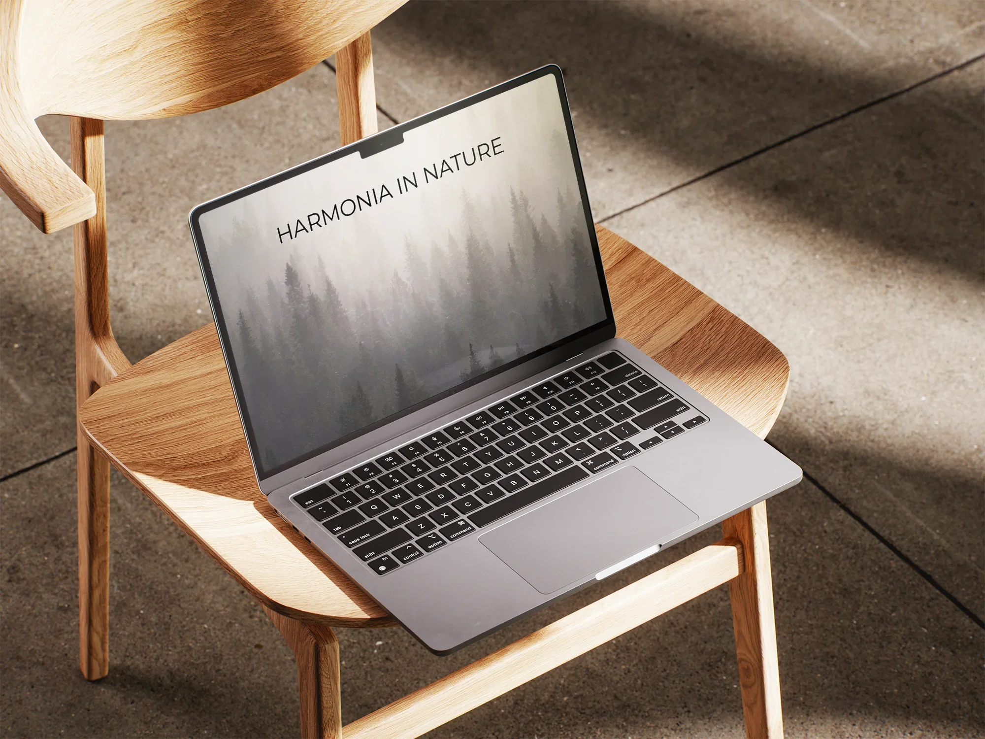
A high-end laptop displaying atmospheric imagery, representing the first moment of visual impact

Attention is easy to win and easy to lose

Many images are designed for the first second. High contrast, dramatic light, big emotion. They work well for stopping a scroll, but the effect can disappear just as fast. The viewer registers the impact, and then moves on.

That is the problem in places where decisions are made. A project page, a licensing page, a proposal deck, a hotel brand site. In these contexts, the viewer is not looking for a visual hit. They are looking for clarity. They want to feel that the message is controlled and reliable.

Real impact starts after the first second, when the image still feels steady and relevant inside the wider context.

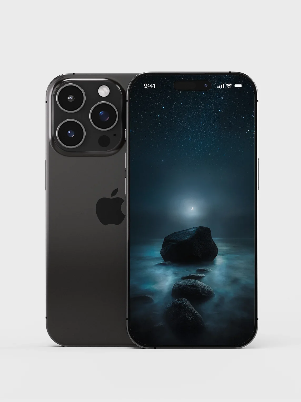
A smartphone displaying calm imagery, illustrating impact that remains clear on a small screen

Working on a project where photography needs to earn trust? See the Studio approach on the Projects page.

"Good imagery stops the scroll. Great imagery keeps the page calm enough to read."

Strong does not have to mean loud

A strong image can be quiet. In many cases, quiet strength performs better because it does not compete with the rest of the page. It gives typography room. It supports the pacing. It makes the experience feel curated rather than crowded.

This is where attention becomes usable. The viewer stays long enough to understand the offer, the context, and the intent. That is the difference between a quick reaction and a considered decision.

Precision

Composition that feels deliberate, clear, and stable across screens and layouts.

Depth

Images that still hold interest after the first glance, without adding visual pressure.

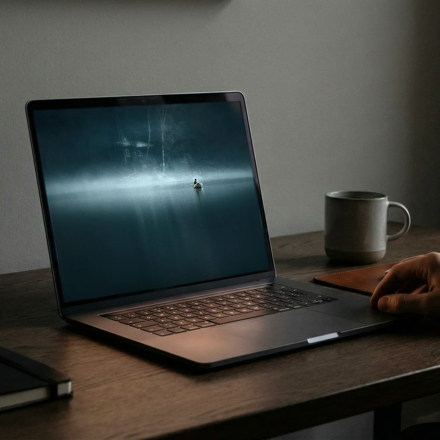
A laptop showing restrained landscape photography that supports longer viewing

Imagery can stabilize the experience

In professional decision-making, the viewer is often scanning for signals. Is this consistent. Is this careful. Does this feel dependable. The visuals carry part of that answer.

When imagery holds attention without escalating tension, it communicates control. It can make a brand feel more mature. It can make a space feel more considered. It can make an editorial layout feel easier to spend time with.

The result is simple. People stay longer, and they take the next step with less friction.

A restrained visual presentation on a laptop, emphasizing stability and calm pacing

Where this matters in practice

This approach matters most when the decision takes time. Brand websites, licensing libraries, editorial platforms, and high-consideration services. In these environments, the image is not a one-off impression. It is part of the atmosphere of the whole experience.

The goal is not to push the viewer forward. The goal is to remove reasons to leave. When the visual tone stays calm and consistent, the viewer can focus on the content and make up their mind in peace.

That is why restraint becomes practical value. It improves readability, increases dwell time, and helps trust form without forcing it.

A professional environment where large format photography supports calm and focus